


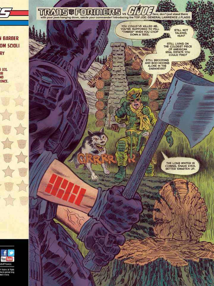
Apple’s iBooks have updated with a three page preview of the new ongoing from IDW, Transformers VS G.I. Joe. This ongoing series crosses over two of Hasbro’s biggest brands in a refreshingly different and retro style. The preview shows us a nice slice of G.I. Joe action without any sign of the Robots in Disguise – but even on the third page you can see a hint of what is in store.
Strap yourselves in because this series promises to be a wild ride when it hits on July 23 2014!


AgentAlabama113
MegaRoadbuster
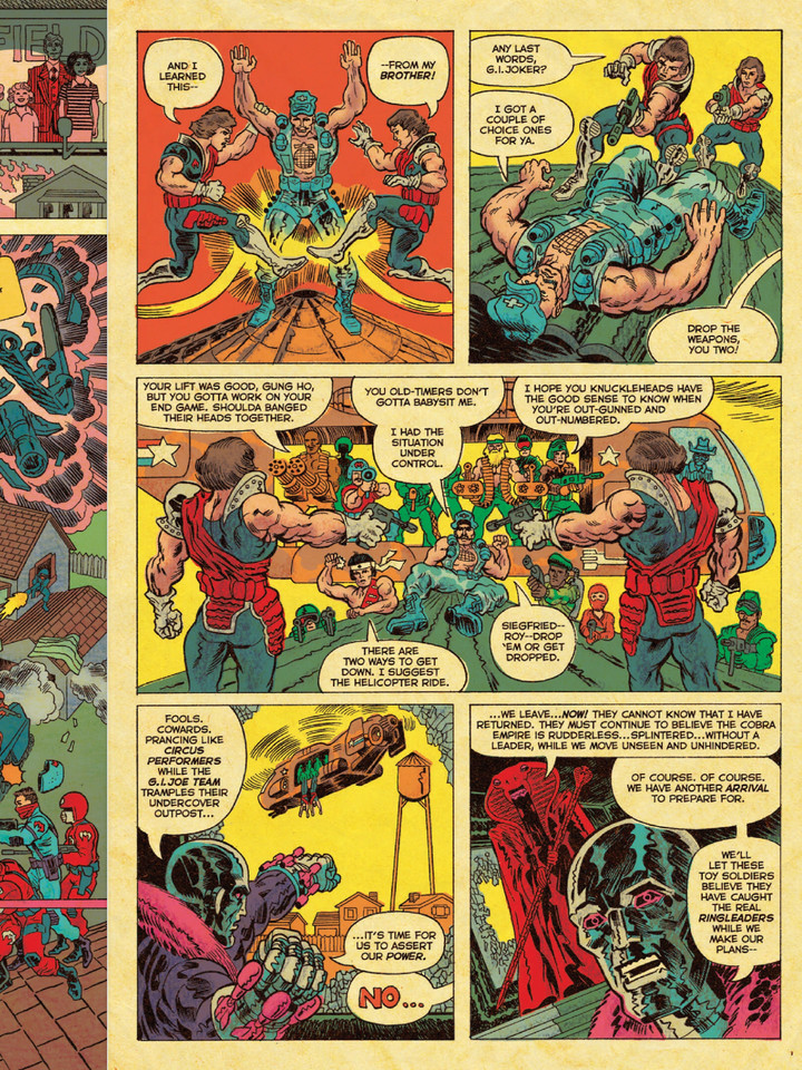
You know, given that the Serpentor looking character has glasses, I gonna make a guess that it's actually Baroness. Remember she goes down with CC in the FCBD issue. So it would make sense for her to keep her "Return," a secret, since she's probably thought dead.
WilyMech
I actually agree with this assessment here.
LegendAntihero
Serpentor's going to be in it. Cool. I wonder if IDW will shoe in the Serpentor toy TFCC is going to make next year
MegaRoadbuster
AWESOME!!!
One more week!!!
To those who hate. Keep hating. First issue already sold out.
Megastar
Sold!
LegendAntihero
I've got to admit, I find this as interesting as other Joe/Transformers books
Feralstorm
Looks too much like a well- used coloring book for my taste. I couldn't stand any part of the free comic book day edition, so I guess I shall pass.
Bass X0
Its not supposed to look nice. Its supposed to look retro.
Thankfully, block-coloring is kept to a minimum and used only when appropriate.
DPrime
Yeah, I'm digging this, I think.
Sockie
With Serpentor talking about how "they cannot know [he] has returned", I'm wondering if they're combining him and Cobra Commander into the same character? Probably won't be the case and it'll just turn out Serpentor's appeared before in this continuity, but hey, a fun thought.
Antimatter
Yep, this continues to be an amazing riff on Jack Kirby's style applied to GI Joe
Definitely want more Transformer action, there should be some in this ish with more focus in 2. That last panel of Destro is incredible.
Krommdor
LOL yeah there is a lot going on with their arms haha
All in all I think the art isn't the issue so much as how it is colored in. That is the part that truly looks like a Child did it. Reminds me of old Marvel and DC limited color pallets. And I suppose that is intentional, but I mean… like.. shit… just add some shading and depth please. It would look a whole lot nicer.
Dormamu
Where's that picture of Prowl flipping his desk?
That has got to be the worst drawing ever. No, seriously, I could pull an 80's Joe book and it would still be better than this. Whatever, if it flips your own desk, then go for it. I suppose ashcan comic artwork is still a thing.
jestermon
They always had very big jaw lines in any version I have seen.
deathsheadII
it's like stepping back into the 80's
Digilaut
Haha, this is amazing!
Plainsjumper
Are Tomax and Xamot supposed to have the mumps or something on their arms? *edit* and Gung-Ho's arms as well? Or does the artist just not understand human anatomy?
Chris McFeely
*much flailing* nearly here nearly here nearly here
Anthony _aggro
IDK…. the art still looks like a little kid did it. It is all muddled with bad lines. It is like they are just trying to force as much into one frame as possible. It makes it visually hard to follow. It is just kind of unappetizing. The dialogue is better than the Free comic book day preview, but they really need to step up on the art.